MiniatureBuildings.co.uk : Exploring model buildings of all sizes and styles
- Page (top)
- Home
-
About
Us -
Recent
Articles -
Scales &
Uses - Modelling
-
All
Articles
Miniature Buildings
(top of page)
Home
Articles
- Miniature
Buildings - Home +
-
Recent
Blogs -
All
Articles
.
Miniature Buildings
Some thoughts on building models of all types and sizes
Some thoughts on building models of all types and sizes
Welcome. If you have not visited Minature Buildings before can I suggest you begin with my Aims and Scope article or at the Home Page. If you have visited before - welcome back. I hope this article is of interest to you.
Wallis Manor
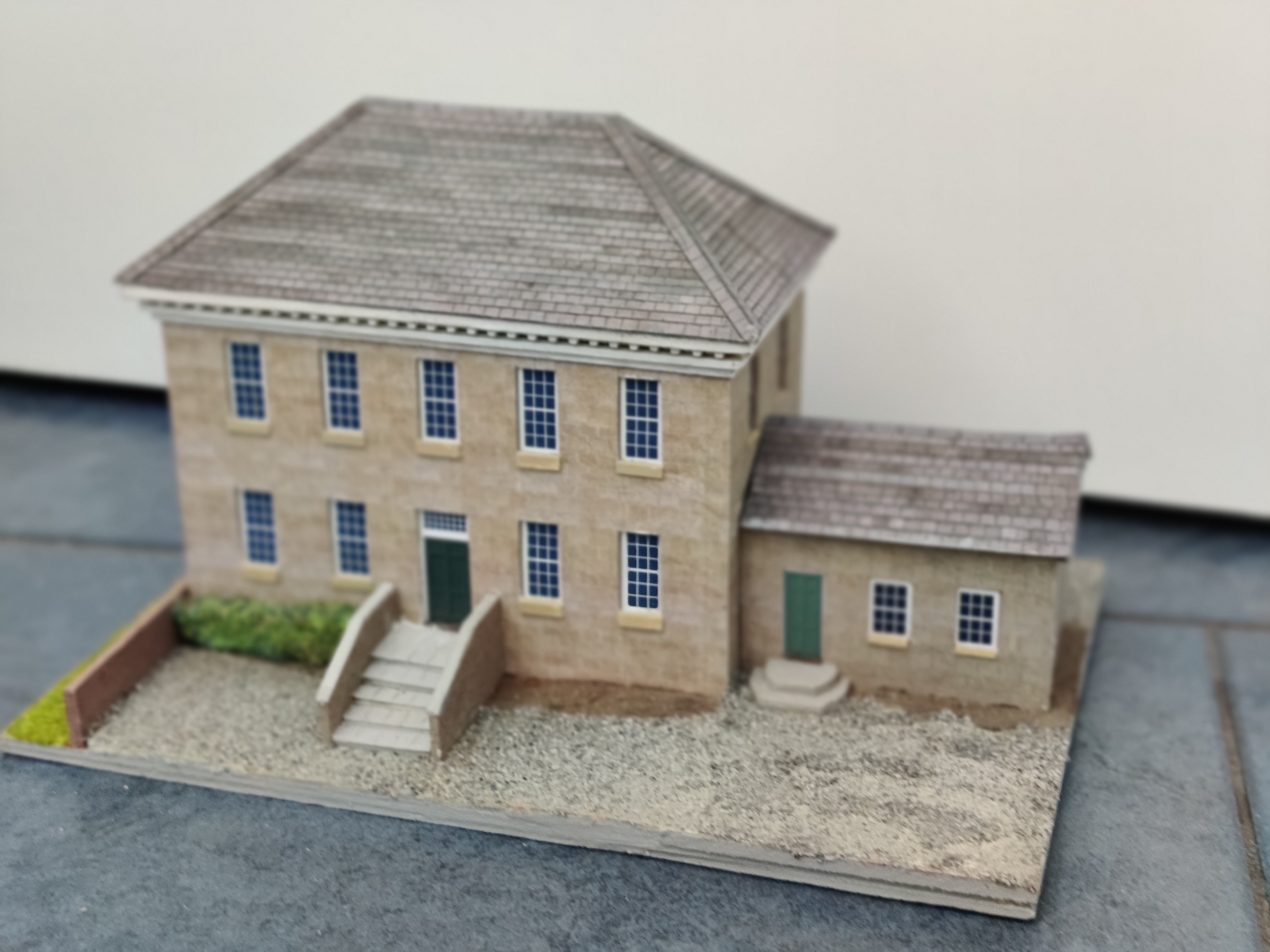
Just for a change; a piece of my own work. This was been a project with an inordinatly long gestation period. Begun, postponed, forgotten, resumed, delayed, neglected and finally finished in a sudden burst of activity. Getting back to it was inspired by some of the great work of members of the 'Mostly card & paper' Facebook group. Among whom I would give a special mention to the inspirational Pickwick Line whose Facebook posts unfortunatly stopped suddenly in 2022.
I think Wallis Manor fits, just, inside the mostly card and paper definition. Or maybe not. It's not an issue for me. I'm not purist and there are several sorts of wood used, and some plastic strip. But it is 'scratch built'. The only bought-in components are the Scalescenes slate roof texture and the grass scatter.
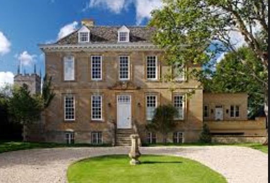
The core of the project is a hand-crafted wall and window texture laboriously designed in Photoshop Express - a program I am very happy with. The original inspiration was a random Georgian House found with a Google Images search. I'm afraid I have no idea where it is. Way outside my range it is pretty much my dream house. The main frontage has been copied as closely as I coud but the sub-basement and the door portico have been abandoned as I went along. The roof detail owes more to another photo.
A long time ago a photo was imported of some sampled stonework but the original image is long gone. It has been copied, pasted, overlaid and tweaked to generate the pattern I have now. It has also been recoloured. I love this feature of Photoshop. The ability to darken, lighten, change colour saturation and to increase or decrease the proportion of the basic process colours.
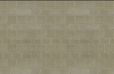
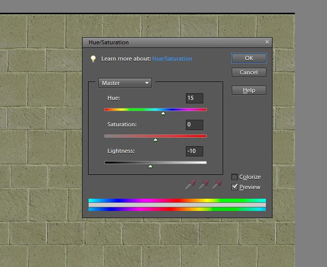
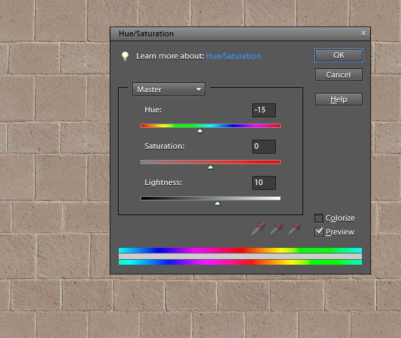
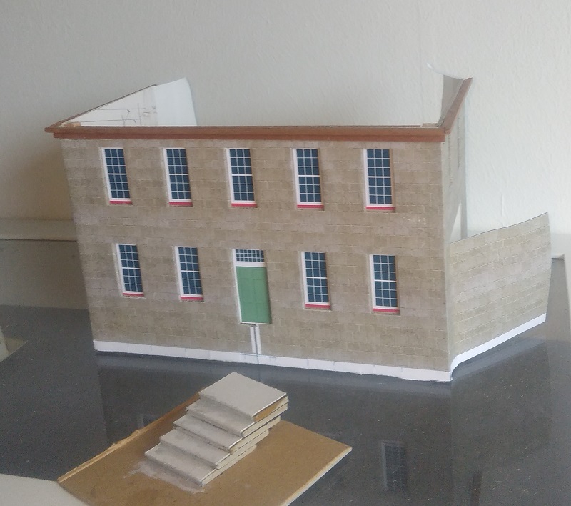
The window sizes were set as multiples of stone sizes and marks set for the necessary cut-outs in the wall. The layer system in Photoshop enables the sheet with the window detail to be precisely aligned. Working to a scale of 1/76 I set the resolution at 608 pixels per inch such that 1 pixel equates to 1/8 inch. Using the weird hybrid equivalent of 4mm to the foot the setting is 240 pixels/cm.
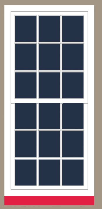
These are not photo images with subtle borders but drawn pixel by pixel with hard lines. Not to everyone's taste but I like the way it enables me to produce multiple variants. The red strip highlights for me where I will eventally position a window sill. Made from wood or styrene strip rather than card - for greater precision. But, next time I will do the window sills a bit differently and use the thickness of the wall as the back part of the sill.
(If you are not familiar with Photoshop at all or want to follow my workings in detail I am going into a lot more detail in a Walls in Photoshop article.(still under construction)
The roof is wooden framed with printed card laid in strips on the surface. The decorative joist ends foring part of the cornice are small lengths of square section plastic strip with spacers of small section timber in between. To make sure the length was right and the cuts square I made a small jig - which I firmly recommend as a technique. I should have done it for the window sills as well.
I used the Scalescenes slate texture for this roof. I'm in two minds about it. Although a Scalescenes fan I have two reservations about their slates. To my eye they are just a bit too weathered and varied in colour. And the overlap doesn't feel quite right. For my latest project I am working on some scratch designed slates of my own. Regardless of the source of the texture I have learnt three or four lessons from this and other builds. First is that the slow process of cutting and fixing strips is worth the effort. A simple flat print is OK in my eye for brickwork but for roofs the extra texture of overlapping rows is really needed. At least in 1/87, 1/76 or larger. The jury is still out for 1/144 or other N scales. The second is that applying a grid print first makes so much easier, and the result a better one.
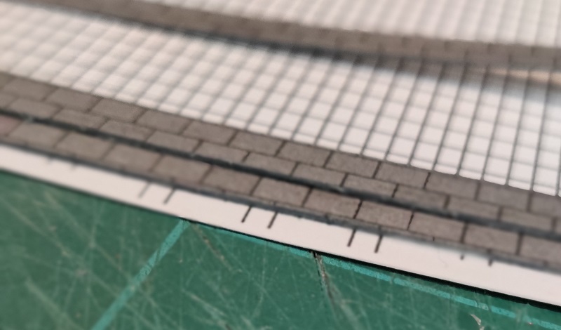
The grid has two functions - keeping the horizontal placement straight and making sure that the offset in successive rows is accurate.
The third is how important it is to colour the visible edge of paper strips - before they are fixed in place. I have tried paint, felt tips, crayons but felt tip and paint are too prone to bleed onto the front of the paper or card and crayon is hard to get full coverage. My method of choice now is to use wax crayon - using the side of the tip. My last suggestion is that it is better to make the tile or slate sheets off the model and then apply the finished sheets, rather than trying to fix the strips in situ on the roof itself.
On the subject of roofs, I am coming to realise with each successive build that it is important to be clear before building about how the edges of the roof are to look. Both at the eaves and at gable ends. Roofs are perhaps the easy bit. Fascia's , soffits and gutters are more tricky.
As always, e-mail Miniature Buildings at
MiniatureBuildingSite@gmail.com if you have something to add. Comments, criticisms, errors you have spotted, extra thoughts, pictures, or even complete articles for inclusion in the Miniature Buildings site are all welcome. Or if you would like to be added to my mailing list to hear when a new article is published.
David, January 2021